The "ABC" of CSS animation

*Disclaimer: this is just a quick guide for people who are finding it hard to get a hang (an understanding) of animations in CSS. This article won't take you from "zero to mastery" but it'd touch the fundamentals.
Animations in CSS is like the most interesting thing about CSS (IM0), 'cause almost everyone loves to see things move, I mean, really, something should just move! I'm sure there are a lot of other things most folks love about CSS.
CSS animation gives you that opportunity to get/catch the attention of folks who visit your website or web-app, (good) animations in CSS adds a good user experience to your web-app/project
To animate means to bring to life --Rachel Cope
Two things are the foundation of any CSS animation, the "Keyframes" and the "properties" that define how the animation works.
Contents:
keyframes
A keyframe (represented as @keyframe) tells what the animation would look like, during each iteration (stages), the properties are just normal CSS properties that you would like to alter (animate) during each stage.
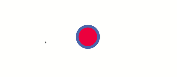
Let's say we want to make a ball that bounces. We would need to create a keyframe that holds the details of the animation. The keyframe will contain the " name of the animation", "the CSS properties", and the "stages" as we've mentioned in the previous paragraph, the stages are represented with percentages in the keyframe block.
@keyframes bounce {
    0%  {
        transform: translateY(0);
    } 25% {
        transform: translateY(300px);
    } 50% {
        transform: translateY(200px);
        border: 1px solid cornflowerblue;
        border-width: 35px;
    } 75% {
        transform: translateY(50px);
    } 100% {
        transform: translateY(-100px);
    }
}
To be able to do great kinds of stuff with CSS animation, one would need to have a basic understanding of how the CSS "transform" property works. Check this resource on css transforms, if you feel you need to brush up.
At 0% (i.e. the initial "stage" of the animation) the ball's (yours could be a box, your choice) position is at zero, from the transform property set to translateY(0) stating that the ball should be at point "zero" on the
"Y-axis".
The same logic applies to all the other stages. At stage 25% the value of the transform property is set to translateY(300px) which pushes it "300px (pixels)" down, on the "Y-axis".
The transform property is not the only property that can be passed into your keyframe. You can pass in any CSS property in your keyframe, to make great animations, it really just depends on your creativity.
So now, let's see apply this animation to an element.
<!-- this div holds our ball -->
<div class="ball"></div>
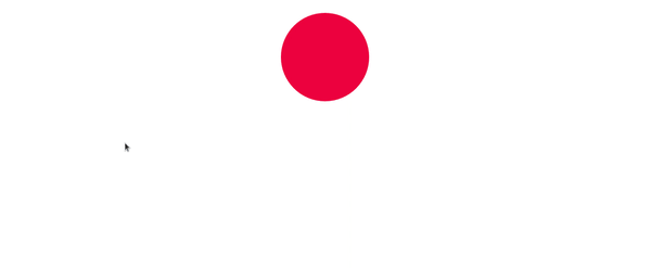
Adding the styles (including the animation property) to the ball below...
.ball {
    margin: 0 auto;
    height: 230px;
    width: 230px;
    border-radius: 50%;
    background: crimson;
    animation: bounce 2s infinite;
}
Checking that up in our browser, we have this...
animation-iteration-count
The animation property that was used above is the shorthand method of using the animation property.
.ball {
       animation: bounce 2s infinite;
}

/* representing it fully would be this way... */
.ball {
   animation-name: bounce;
   animation-duration: 2s;
   animation-iteration-count: infinite;
}
The [animation-iteration-count] specifies the amount of time that the animation should play. Setting it to infinite, allows it to repeat forever. The property takes other values, they are number (a digit), initial, and inherit.
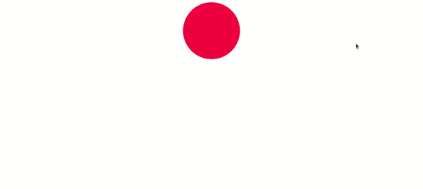
If you observe the first result, you'd notice that the ball's motion isn't all that smooth, it moves a little bit up, stops for a very short millisecond, then moves again. That is as a result of the animation-timing-function.
animation-timing-function
If you noticed also, the "animation-timing-function" is missing in the property that we've declared. Since it is not present, the default value ease (it starts out slow, speeds up, then slows down) is used instead. The other values are linear, ease-in, ease-out, ease-in-out, initial and inherit.
.ball {
       animation: bounce 2s linear infinite;
}

.ball {
   animation-name: bounce;
   animation-duration: 2s;
   animation-iteration-count: infinite;
   animation-timing-function: linear;
}
Adding linear to the animation property gives this...
animation-play-state
The animation-play-state property lets us know of the current state of the animation, whether it is "playing" or " paused".
It has two values playing and paused
Let's see this example when the mouse hovers on the ball, the animation is paused and when it is removed, the animation resumes
.ball:hover {
   animation-play-state: paused;
}
Conclusion
The animation properties in CSS isn't limited to the ones we've seen in this article. You can read about them here
Check this resource concerning the different values of the animation-timing-function here.
For taking out your time to read this article, I want to a very big THANK YOU! I look forward to seeing the awesome stuffs you do with animations in CSS!
If the article has helped you understand a thing, or two about animations in CSS, kindly like and share it with your colleagues.


